So the dust is starting to settle as we become familiar with a number of techniques for developing responsive websites, but for myself, this road has not exactly been as problem-free as I thought it was going to be. Time for some quick reflection on a recent project and the challenges of "going responsive".
First, a quick overview for those unfamiliar with the concept of responsive web design.
"Day by day, the number of devices, platforms, and browsers that need to work with your site grows. Responsive web design represents a fundamental shift in how we'll build websites for the decade to come."
Jeffrey Veen
Responsive web design is a name given to the process of designing and building a website that responds to the device which is accessing it, delivering an appropriate layout. For example, instead of the traditional approach of designing a small-screen version of a site for mobile users, this approach requires only one website, including behaviour and styling rules to determine how it should appear on any-sized display.
This is not a new idea: as early as mid-2007, I've added support for both 760 and 960 pixel widths for sites with JavaScript, however more recent support for CSS3 media queries from modern browsers, plus great articles from Ethan Marcotte and Jeremy Keith, have helped move this process into the mainstream. Many have also called responsive web design the new "best practice", essential for moving our profession into the future.
In theory, it's quite a simple premise: serve different styles for different view-port widths, however it's been a fairly long learning curve from a development perspective. We've adopted a lot of new processes, tools and methodologies to try and make life a bit easier for ourselves.
In my day job, we're currently putting together a full redevelopment of our website. This will be the fifth responsive web design project that I've been involved with.
For the design side of things, we're designing to a 12-column fluid grid, making sure that everything snaps to this grid. A grid imposes order to web pages and provides a solid visual and structural balance and consistency to the layouts. As the width of the browser's viewport changes, certain content containers change the number of columns they use and re-wrap and flow to provide an optimum layout for that width.
We're using a modified version of the Semantic Grid System by TwigKit. We are also using SASS to write our stylesheets, which I've fallen in love with, and has become an invaluable tool for CSS development.
Because this is a CMS website with any number of possible page content configurations, we needed to find a grid that will work for all possible situations. We went with 12 columns, as 12 can be divided by 2, 3, 4, and 6 equally, providing a large number of combinations to best display our content, regardless of the screen width. Once we had the grid and gutters set up, it makes it lot easier to try different layouts.

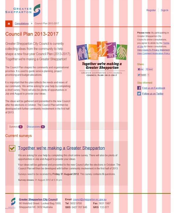
Work in progress screenshot showing grid overlay.
One of the biggest challenges is deciding the best possible order to display the content on the page. When the view-port is narrow, everything gets shifted into a linear layout with one column for everything. When the user is scrolling through the page on their smartphone, tablet or smart TV, which content should be at the top? How much space should the top header take up? Should the local page navigation go above or below the page content? Should the image go above or below the intro paragraph? Or below the entire article? Is there anything in the sidebar that needs to be at the top of the page or can it all shift to the end, just above the footer? There have been a lot of these sorts of questions.
The other thing to think about is page download times. Unfortunately, there's still no ideal standard solution for responsive images. This means that we still need to serve larger resolution images to small-screen users. We've tried to address this by greatly simplifying our overall design with a focus on serving leaner, faster pages for everybody. By removing many of the unnecessary background images, patterns and other flavour imagery from our template, we've freed up hundreds of KB of bandwidth per page, which can be better utilised in serving higher quality relevant photos.
Many of the early responsive web design tutorials recommended setting about four 'standard' break-points (page widths where the layout changes to fit the screen): smartphone, tablet (portrait), tablet (landscape) and desktop. We decided it's best not to specifically work towards these break-points, but rather design for the content with a fluid layout. It's a bit more involved, but it's much safer to not assume which devices the user is viewing the website on. There are heaps of different phones, tablets, game consoles, smart fridges :-), etc, each with their own resolutions and portrait/landscape modes.
Instead, we've concentrated on a device-agnostic approach, designing the individual parts of the page separately, as components, like Lego blogs, that can be fit together into a layout. For example, what does the main navigation look like? What does a form look like? What about a narrow version of a form? The search bar? The breadcrumbs nav?
We do most of our designing directly in the browser where we can get a good idea of not only how everything will look, but also how it behaves at different widths. We do some of this 'atmosphere' work in Photoshop, where the tools allow for better visual brainstorming, but then we work to move it into the browser as soon as we can.

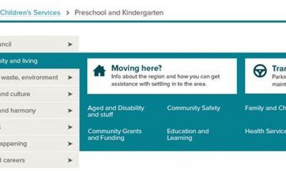
Work in progress screenshot showing examples of atmosphere design elements.
We also use Photoshop to mix up our site's colour palette, making sure that contrast ratios all conform to the WCAG 2.0 accessibility guidelines.

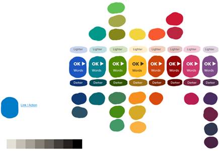
Palette swatch example.
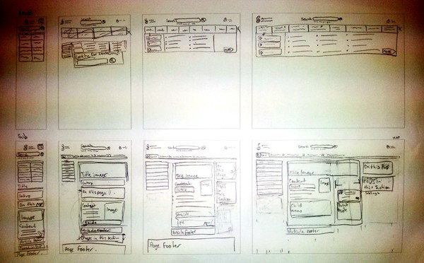
Many people recommend a 'mobile first' approach to design, starting with the base mobile experience then scaling up. I combine this approach with my old methodology, first working on the wire-frames at the very start of the process to see how the layouts could potentially look at different widths. These are used to try out ideas before writing any code, but they usually change once they're in the browser with real content. (Apologies for the crappy camera phone photo below.)

After deciding on the content order and developing the mark-up, the page content is set out linearly, then we start scaling the browser up until it starts looking wrong. During this process, we apply a number of rules that dictate how the page layout should work. For example, I like to use an ideal text line length for optimised readability of around 75 to 100 characters per line. If the text lines get too long, we reduce the column width, increase the font-size or otherwise re-balance the page.
We've set a base-line of browsers that we test in and make sure our site is optimised for.
Fluid layouts can still be a problem. Fluid layouts use decimal-percentage-based column widths that round up to the nearest pixel. Unfortunately, this pixel rounding can be quite different from browser to browser. Most browsers round down to avoid adjacent floats from breaking, but this can result in being a few pixels out once you get to the edge of the page, even more so if you have many, nested columns. This can be designed around when building a new site, but I've had difficulties with this when trying to convert a fixed-layout to be responsive.
Apart from the other browser support stuff above (I'd love to be rid of IE7 and IE8 for good and use IE9 as a base level for support, but that won't happen for a while), something else to be aware of is that we can no longer rely on mouse hover states for things like drop-down menus, as there is no such thing as hover on touch screen devices.
I believe the very most important thing is simply to consider how you can give the leanest, fastest, most streamlined experience for all users, removing unnecessary fluff from the page and focussing on how to best present your content. This is not a limitation, but rather the way web design will need to be going forward. There are some tough problems to solve, but heading towards a more ubiquitous web, we will be much better for it.
No comments on ‘Responsive Web Design Lessons’
Comments are closed
Comments on this post have been closed. If you would like to contact me about this post or for any reason, please get in touch.